


Have you ever held on too long to a winning position? You watch as that former top performer in your portfolio slows down, and then rotates lower, and then really begins to deteriorate, and you just watch it all happen without taking action?
If the answer is “yes”, then you have fallen victim to one of the more frustrating of the behavioral biases called “endowment bias”. Basically, we feel unable to let go of this position because of our emotional attachment, and we hold on to a losing position despite very clear technical signs that we should do otherwise!
Today I’ll share three technical analysis techniques that I’ve found helpful to cut my losses, minimize the crippling impact of endowment bias, and preserve my portfolio through challenging periods.
When in Doubt, Follow the Trend
The biggest issue I find when it comes to endowment bias is that investors simply ignore clear signs on the chart. As my mentor Ralph Acampora once told me, “Analyzing the chart is the easy part. Actually doing what the chart tells you? That’s the tough part!”
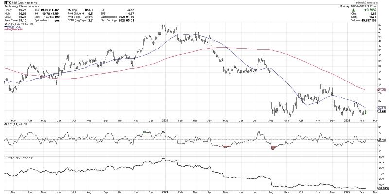
The chart of Intel Corp. (INTC) in early 2024 shows how a stock can rotate from a period of accumulation to a period of distribution. In late 2023, INTC was making higher highs and higher lows, the price above two upward-sloping moving averages. The RSI was mostly above the 40 level, representing a bullish range for this momentum indicator. The relative strength (bottom panel) was steadily trending higher, demonstrating that INTC was outperforming the S&P 500.
By April of 2024, literally all of the previous bullet points had changed from bullish to bearish. INTC was now breaking down through moving average support, the moving averages were beginning to slope lower, and the RSI had moved to a bearish range below 60.
Think of technical indicators like a checklist, and go through the process of evaluating each indicator on the chart to determine whether the current reading is bullish or bearish. And when you get to a point when the bearish evidence outweighs in the bullish, then move on to better opportunities!
Relative Strength Can Bring Additional Clarity
Sometimes a stock will stop going higher, but instead of breaking down it enters a new consolidation phase. Microsoft Corp. (MSFT) showed this particular phenomenon in 2024, as it entered a trading range between $400 and $460 after a new all-time high in July.

Now even though the price trend was now sideways, note how the relative strength line began to trend steadily lower. This pattern emerged because MSFT was holding support, so the price trend was still in decent shape, but other stocks were continuing to pound out a strong second half to 2024.
When you’re holding a stock with deteriorating relative strength, your “opportunity cost alarm” should be going off big time. Basically, while you’re not necessarily losing money holding this particular stock, there are other stocks out there that are still moving higher. So by tying up your capital in this particular stock, you’re missing out on other opportunities to outperform!
Institutional investors tend to be laser-focused on relative strength, as that is pretty much exactly how they are evaluated as active managers. So think like an institutional investor, and if your charts begin to feature weakening relative strength, look around for other places to outperform.
Divergences are Often an Early Warning Signal
Parts of the technical toolkit can be used more as leading indicators than lagging indicators. I’ve found bearish momentum divergences to provide excellent early warning signals, because they will raise a red flag while the primary uptrend is still in place.

The chart of Synchrony Financial (SYF) still appears in decent shape, with a pattern of higher highs and higher lows continuing through early 2025. But notice how the RSI has actually been making lower peaks since early November, despite the stronger price action?
SYF and similar names will usually find a place on my “potential topping patterns” ChartList, helping me focus on charts that are still going higher yet demonstrating similar characteristics to previous market tops. I’m happy to still own a chart like SYF as long as the price keeps showing strength, but the bearish divergence tells me to be ready to take profits if the impending drop becomes a reality.
Mindless investors ignore clear signs of price deterioration because endowment bias prevents them from admitting a change in the technical evidence. Mindful investors, however, have a consistent process for evaluating their holdings, and are more easily able to admit when a chart is no longer helping them achieve their portfolio goals.
RR#6,
Dave
P.S. Ready to upgrade your investment process? Check out my free behavioral investing course!
David Keller, CMT
President and Chief Strategist
Sierra Alpha Research LLC
Disclaimer: This blog is for educational purposes only and should not be construed as financial advice. The ideas and strategies should never be used without first assessing your own personal and financial situation, or without consulting a financial professional.
The author does not have a position in mentioned securities at the time of publication. Any opinions expressed herein are solely those of the author and do not in any way represent the views or opinions of any other person or entity.